
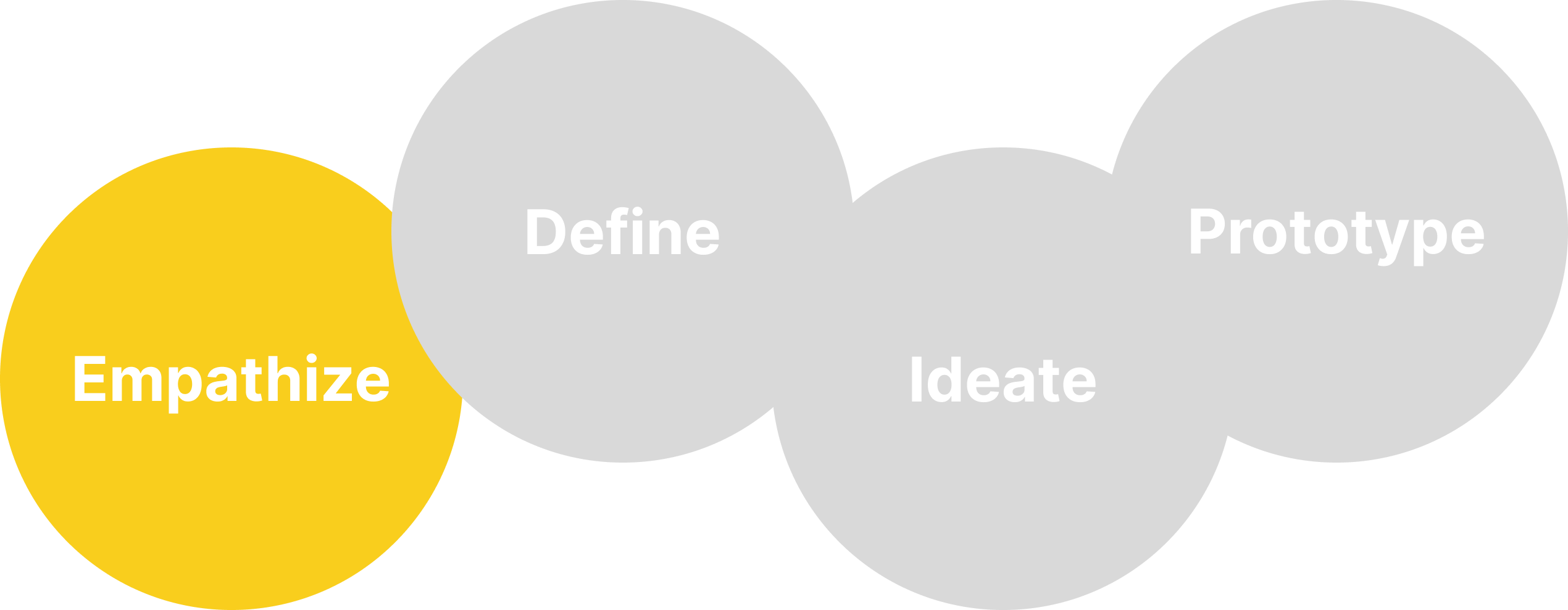
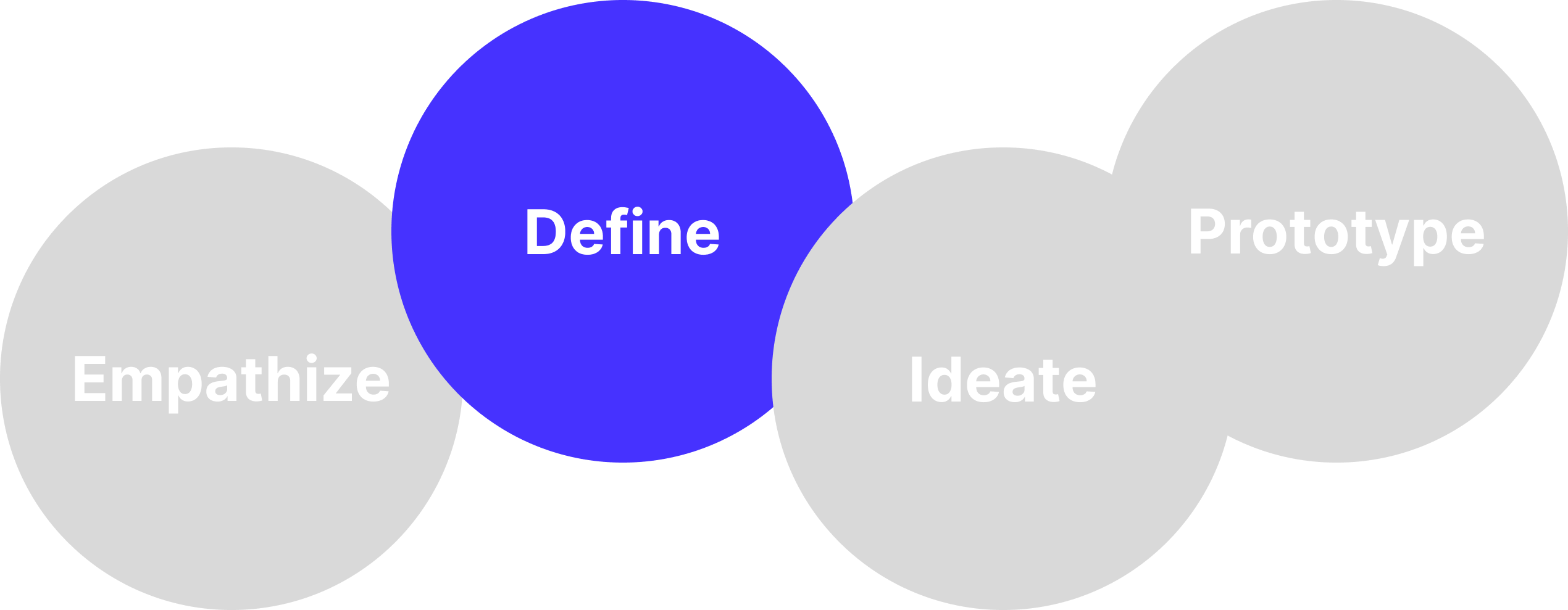
The biggest obstacle in this project was to define the user as it was crucial for us to clearly define who the user for a photographer’s website is. Who could be a potential customer? Who would engage in interacting with such a website with the intent of hiring our customer and not just to look at beautiful photos? We decided that the best way to proceed was to start with interviewing people who worked in this field, in order to have a better understanding of the whole business. We decided to start with the qualitative research, and interviewed another Berlin based photographer - he could tell us how things work in his business, how he got usually booked and who his customers were - the manager of a photography agency and the creative director of a fashion company. What we found out was fundamental for defining the user and thus moving on with our project. Here's a summary of our findings.
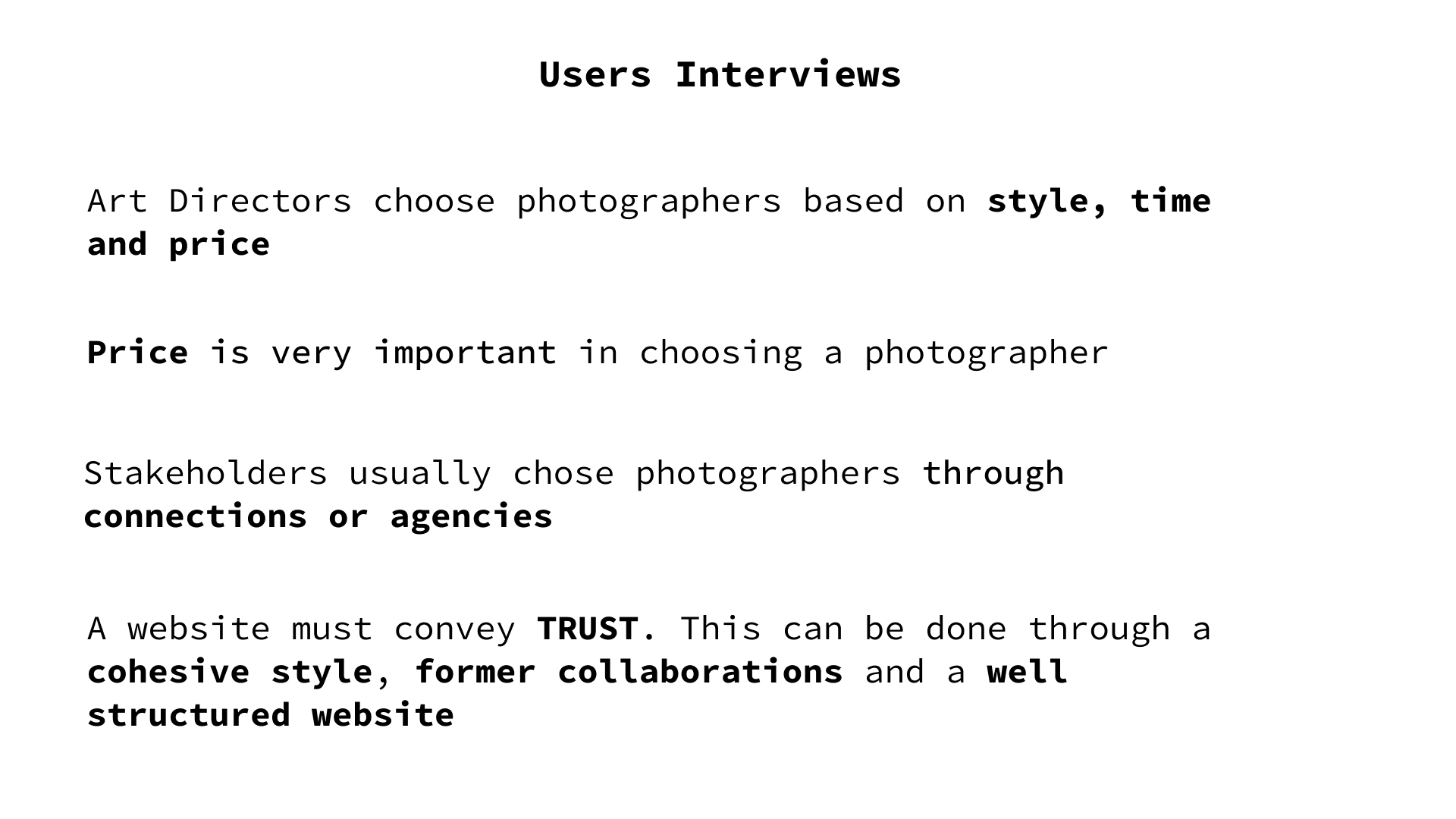
We found out that the website is there to showcase the photographer's work in a cohesive and structured way, it is usually not the first step in approaching a photographer. The booking often happens through connections, agencies or previous collaborations. After that we also conducted a survey that helpd us deifine the user a bit more.

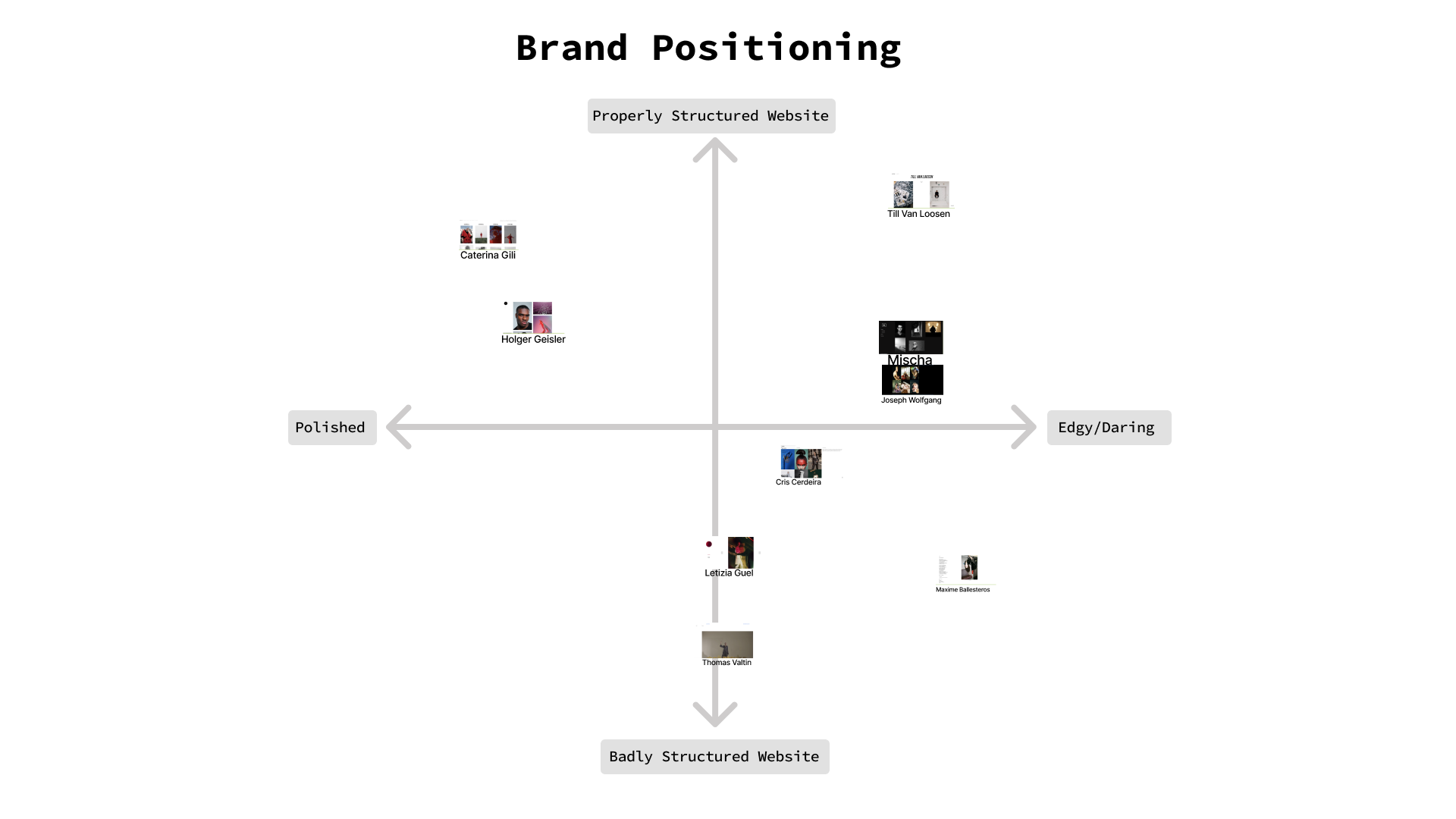
Now we finally had some clarity on how the business worked and on who the user could be. We decided to analyse other Berlin based Photographers and their websites.
-We noticed that most of these photographers' websites were not very user friendly nor did they look particularly professional.
- Many of them did not have a well defined style.
- Categories were missing in many of the websites and photos were showcased randomly.
- Their main focus online and with the most updated content was Instagram.
- When we looked at professional websites of famous photographers they had certain characteristics in common: Structure, cohesive style, easy navigation and high quality pictures.

After that, it was not difficult to position our "customer" on the market. We knew that he had a more daring, provocative style and his website should look professional, showcasing his work in a professional, structured and cohesive way.
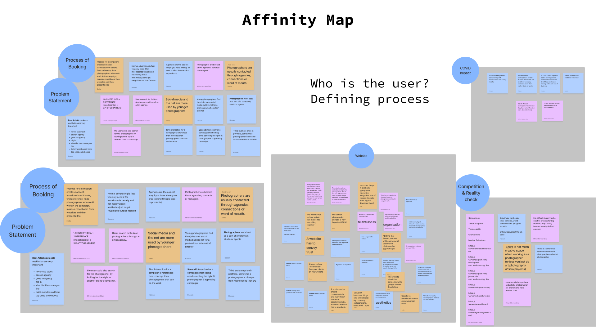
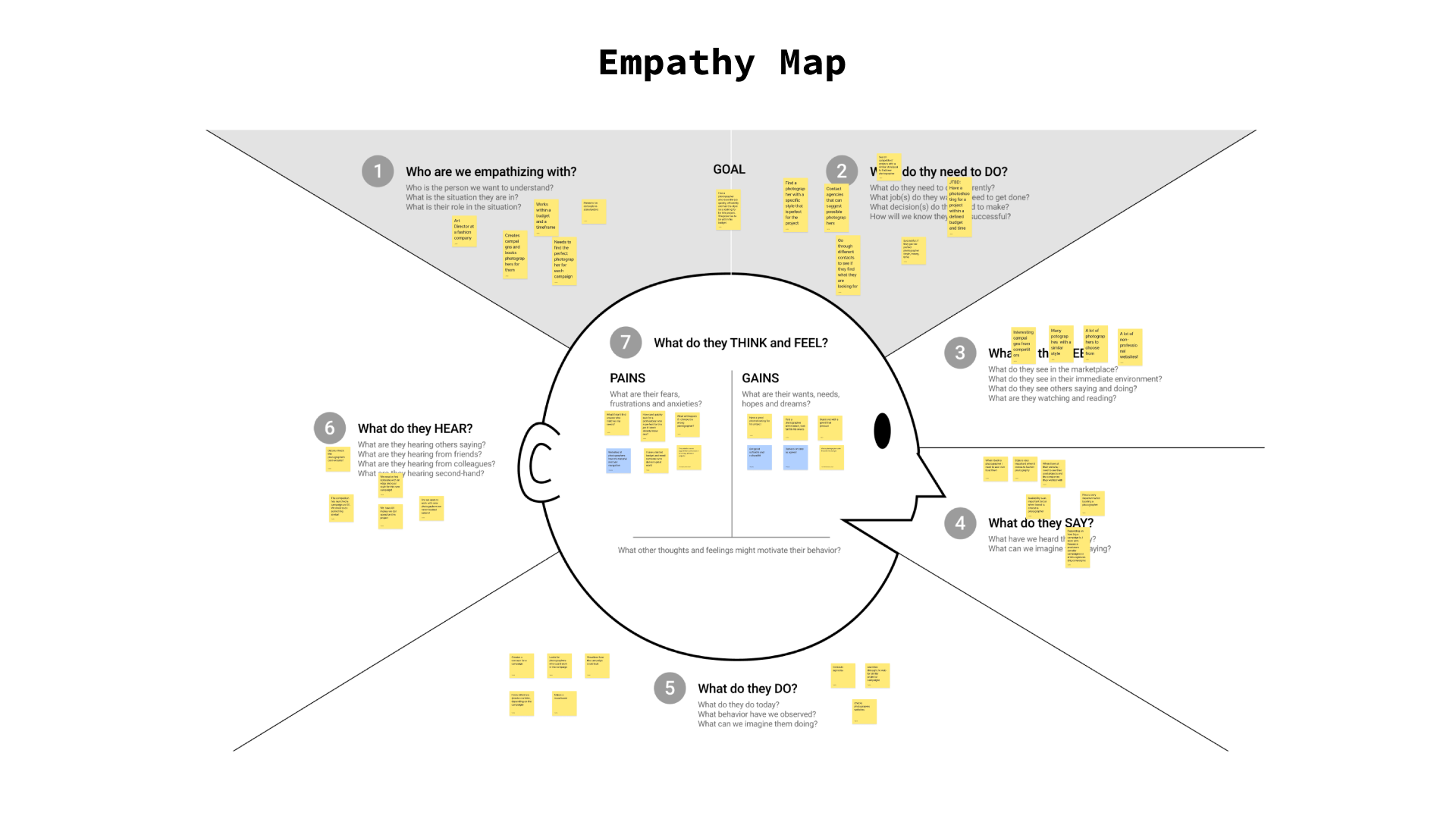
The next step – the affinity map – helped us further in the identification of our user. Each of us wrote on sticky notes all the information we had gathered during the interview. We grouped the ones that were similar and then categorised them.
We wanted to understand the user‘s thought process: what would he think? What were his pain points? What would they feel? For this reason we created an empathy map, that gave us a better understanding of their world and needs.
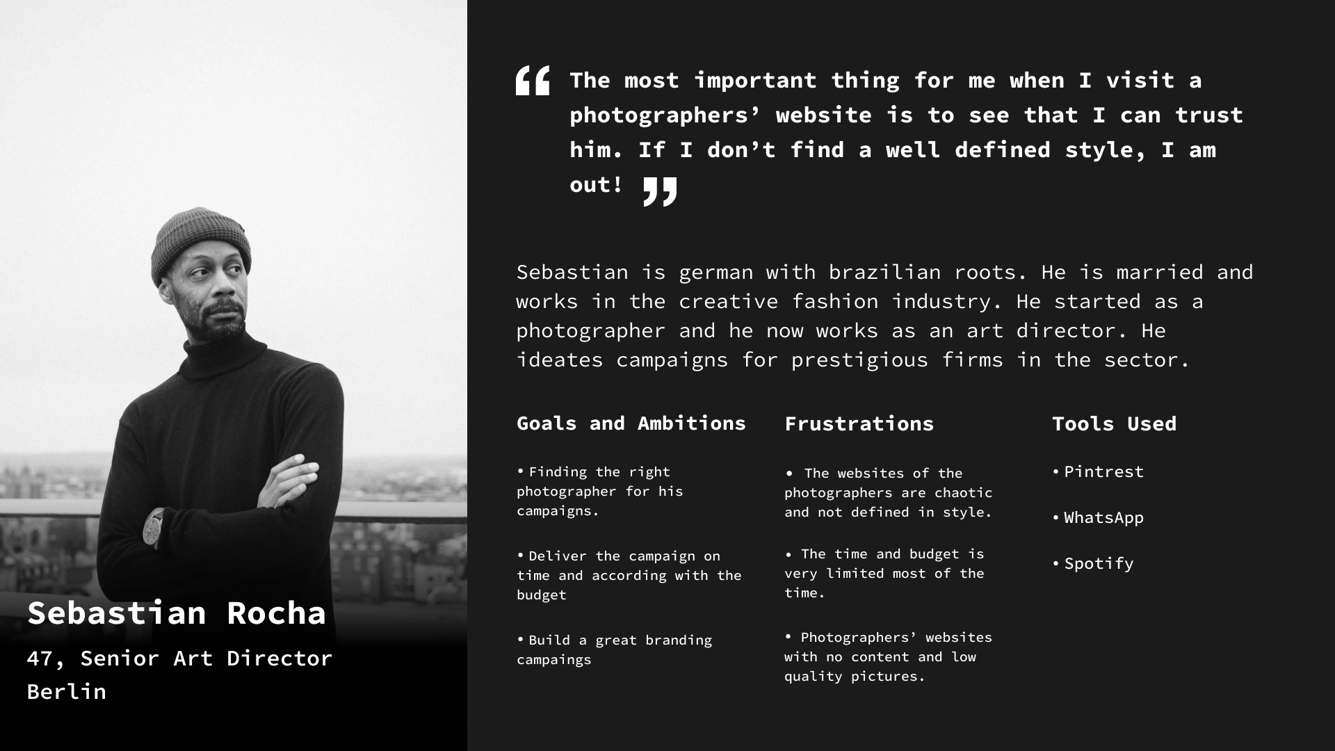
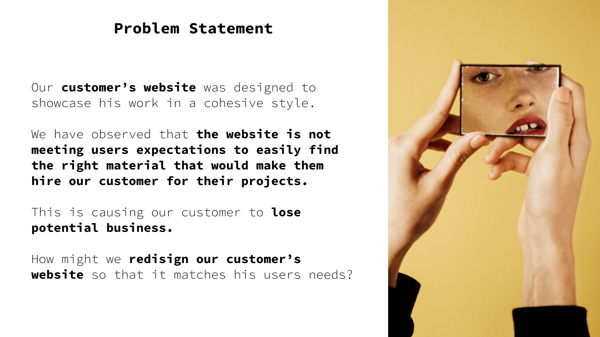
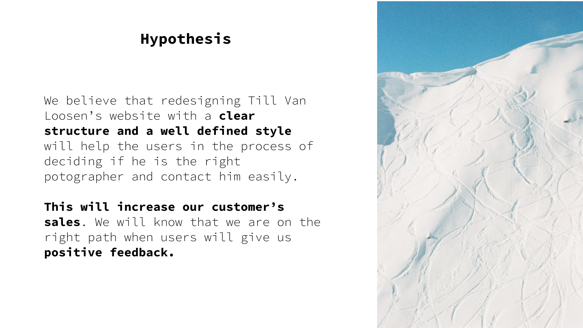
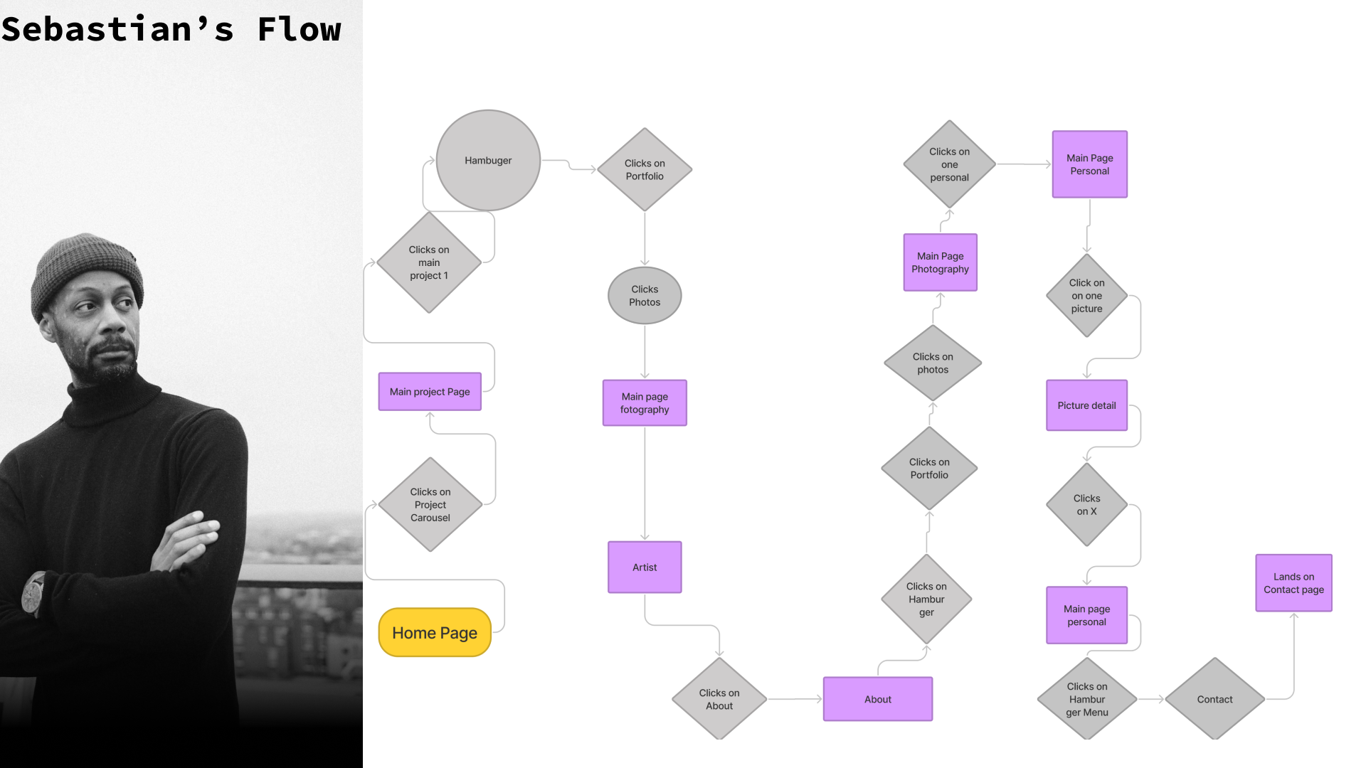
After this process we were ready to create a user persona. His name was Sebastian, a Berlin art director with Brasilian roots. After defining his needs and frustrations we wrote to write our problem and hypothesis statements.
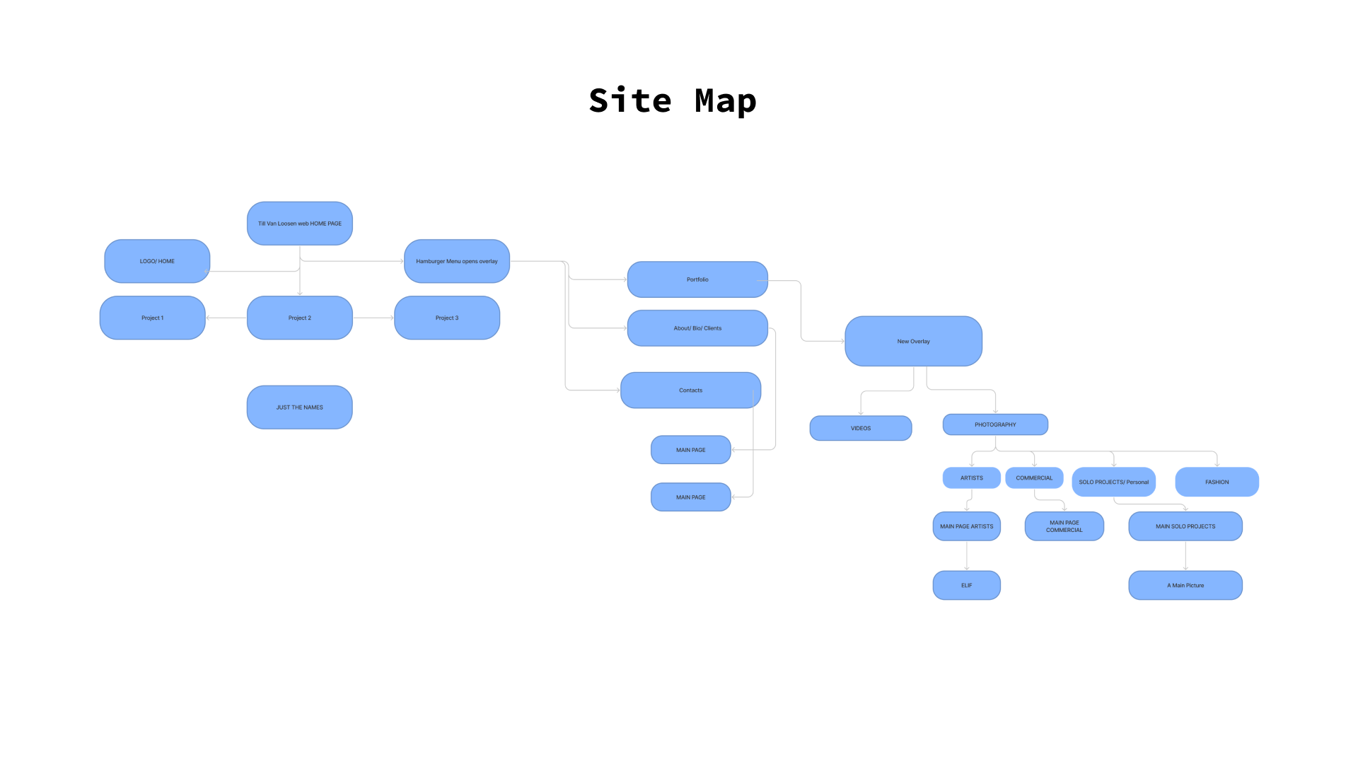
We were now read to start ideating our website. First of all we designed the sitemap, giving the website a completely new structure. Then we created a user flow. How would the user behave on the website? What would make him curious to discover more? We thought that having a look at different projects and categories - recent videos, artist portraits, personal projects - would give him a good idea of the photographer‘s work thus convincing him to contact him.
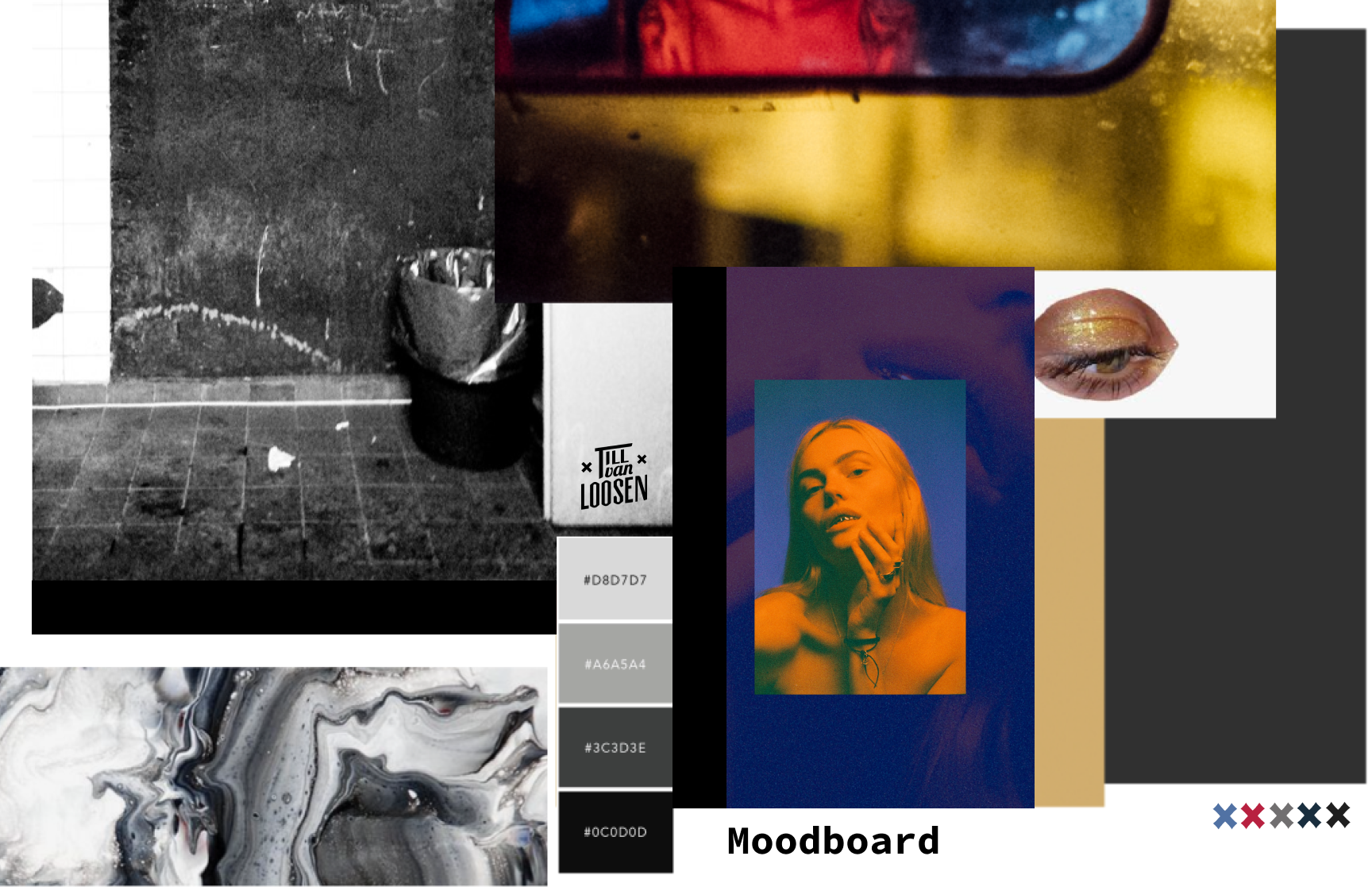
A moodboard with some of his pictures helped us set the mood for the website. We also decided to basically use just black white and grey, since the colours would be given by the photographer‘s work itself.

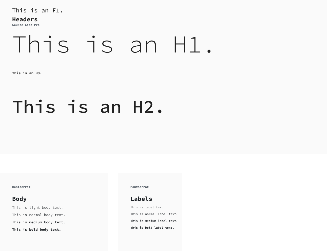
We then sketched our Lo-Fi Wireframes. We each made different versions, then voted for what we liked best. Before starting with the Hi-Fi we created a Style Guide and the essential components that we would use for the whole project.
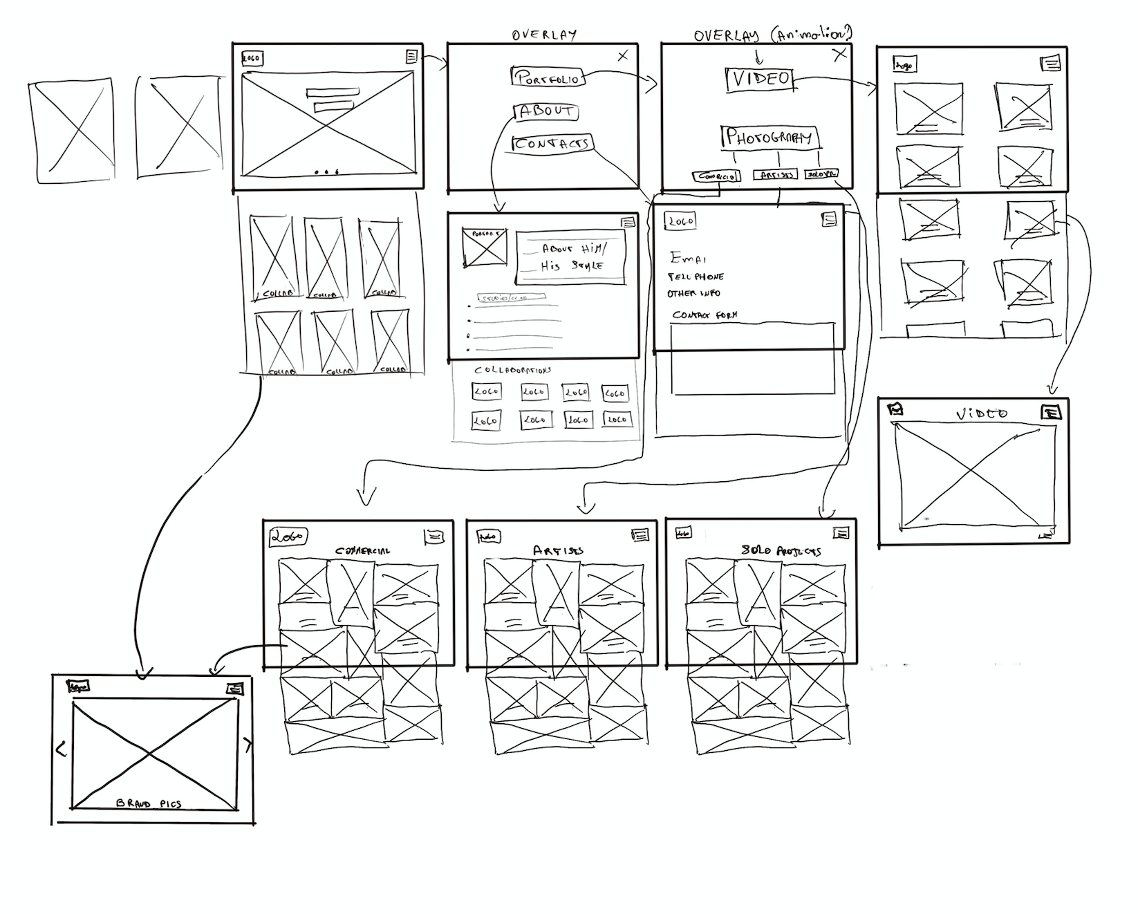
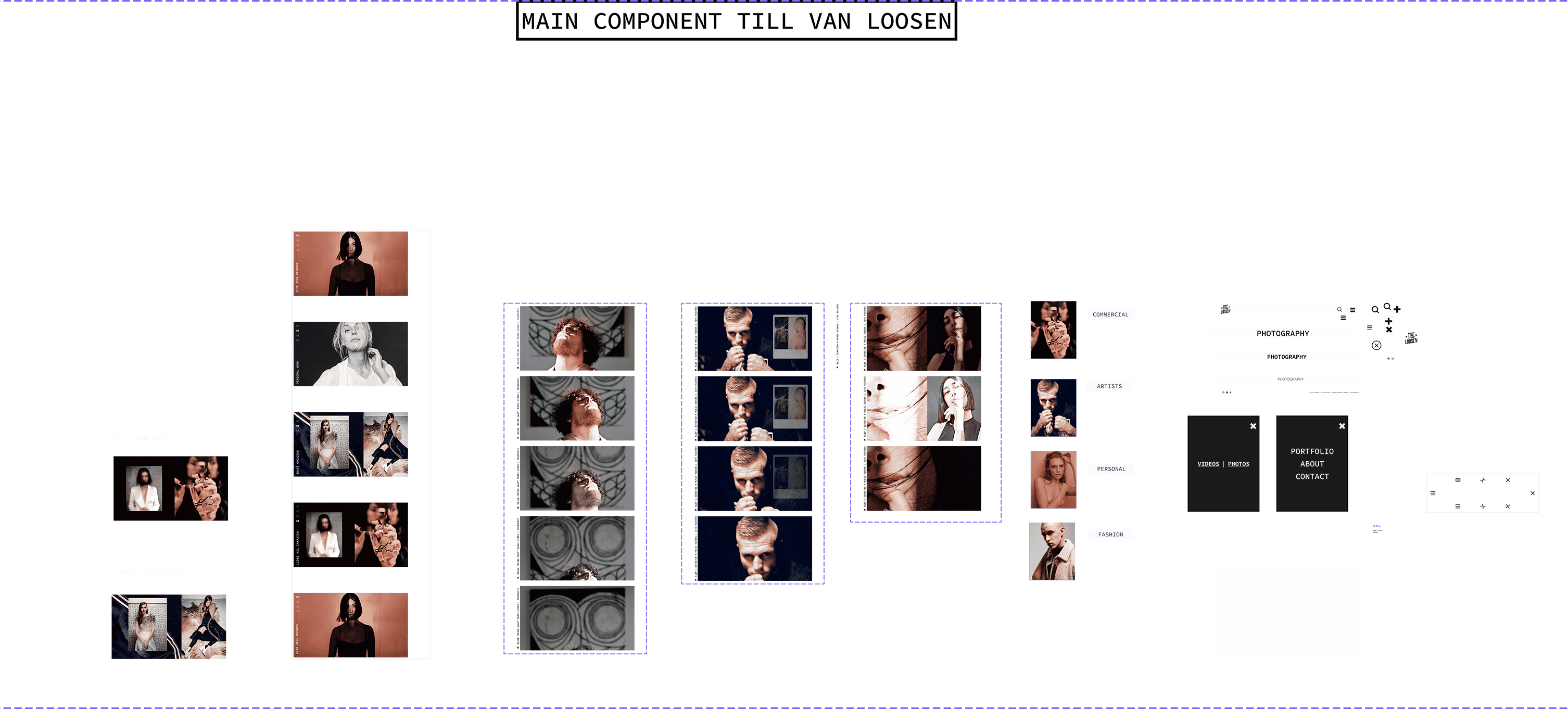
We opted for a carousel in the homepage, followed by a list of collaborations, since our research showed that this was one of the most important things that possible art directors would look at in order to trust the artist. We also chose to insert a button showing his most recent work, another deciding factor for our persona. A list of his best works organised in categories, an about page and a contact page would complete the structure of the website.
You can test the Hi-Fi prototype here
The project was very challenging and it required a lot of concentration, ideation, and patience. We were all determined to do our best in redesigning a website that could be not only visually appealing but organised in a way that it could satisfy the user‘s requirements. Our project was chosen as second best final project for the ux/ui cohort by the student's vote.