
I started with a survey that would help define the problem and would give me an idea of possible features the app should have. I sent out a survey and I had about 30 responses, which was enough for me for a first prototype. It was very interesting to find out what people said they would need in order to keep on track.

Everyone who participated in the survey was interested in trying a habit tracking app or they were already using one. That gave me confidence to go on with my idea, as I now knew there was an audience for it. From the answers I knew that I had to include the possibility to find a buddy to get support during the challenge, add suggestions and send daily reminders . I also thought of a way to include a formal commitment.
My next step was to talk to people directly in order to find out more. The users interviewed confirmed what I had already found out in the survey, and added some new insights:
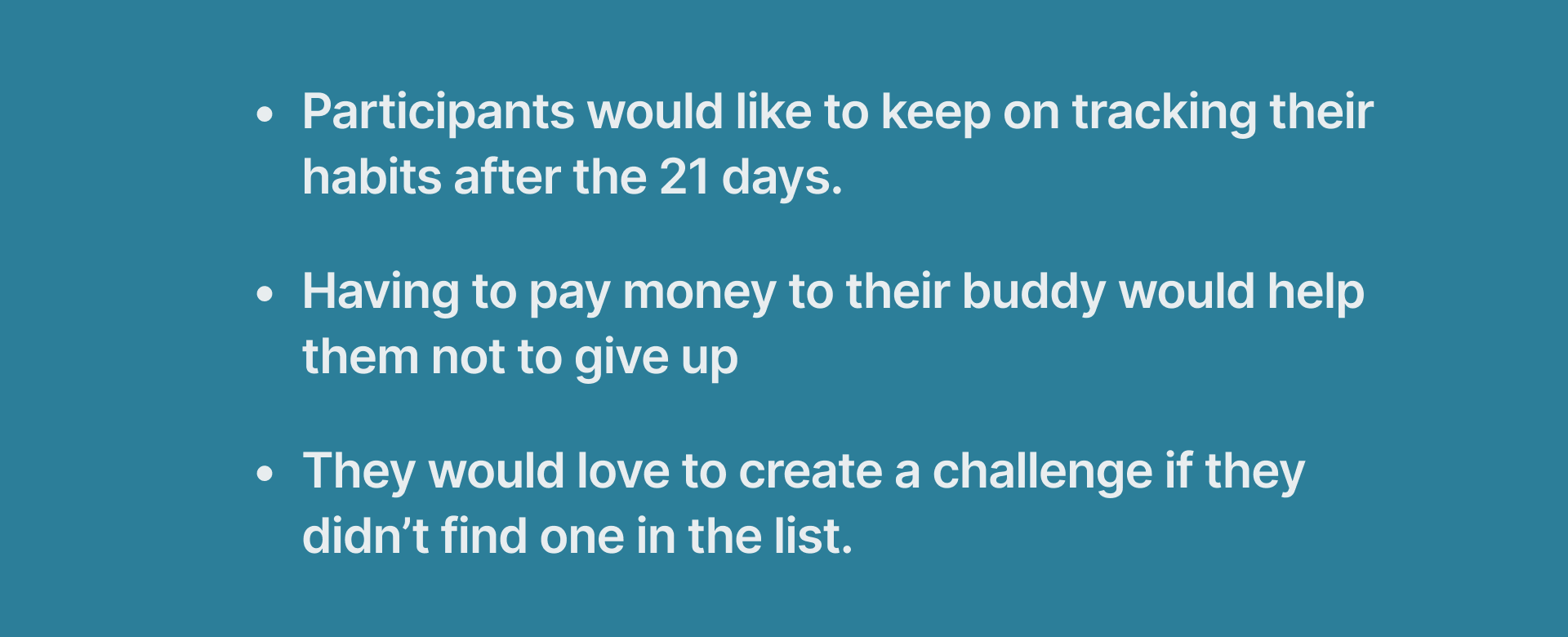
So I now also knew that I had to have a "create your challenge" section that was meant for people who didn't find one for them. The option "keep on tracking" was also very interesting to me, as I thought people wanted to keep the new acquired habit once the 21 days were over.
I now wanted to check If there were other apps that offered the same service and, to my surprise, I found many! I downloaded some of them to see what their features were and if there was a gap in the market for what my idea was.

I found out that many of them were very rich with way too many features that, to my opinion, would confuse the user. On the other side, other options were extremely simple, with only a feature or two.
I wanted to design a product that was neither too crowded nor too simple, that would offer the most important features asked by users during my „finding“ phase, but that was still easy to use and would offer an easy overview of the process.

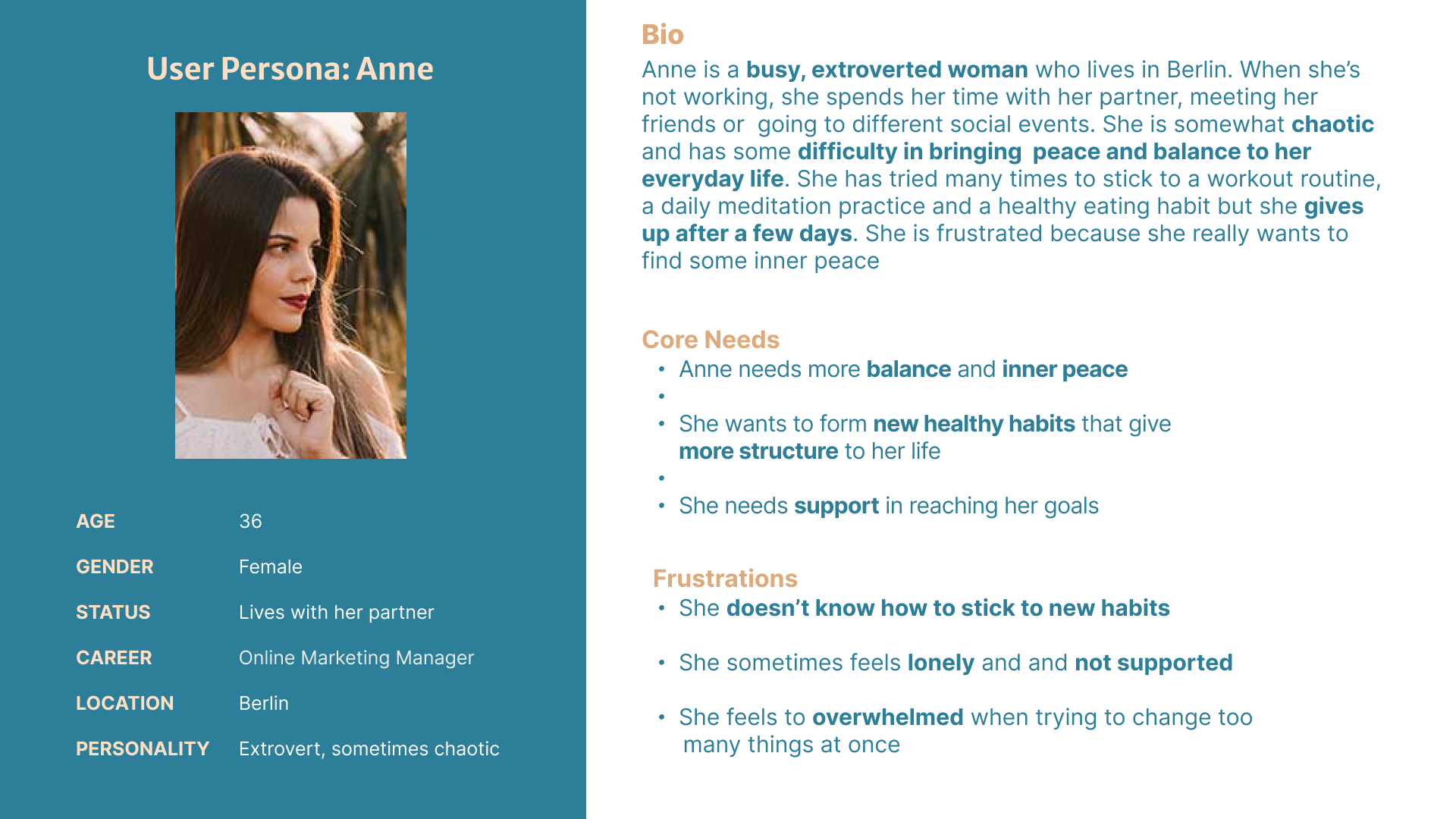
Creating an empathy map helped me understand the user more deeply and see what their fears, worries and problem were and what they needed the most.
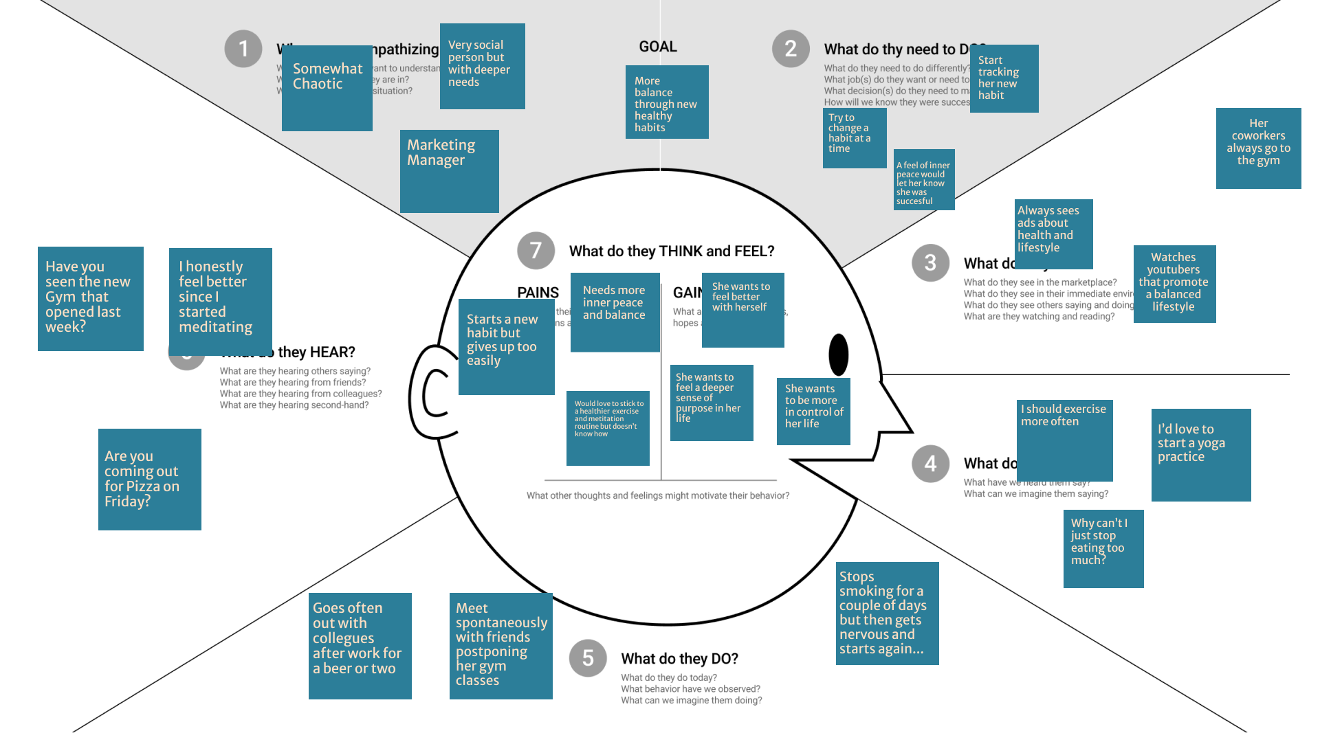
Based on all the information I had I created a persona. The majority of people interviewed belonged to an age range between 30 and 38 years old, were professionals with a lot to do and many interests and a busy social life, with a problem with sticking to a new routine due to their many commitments.
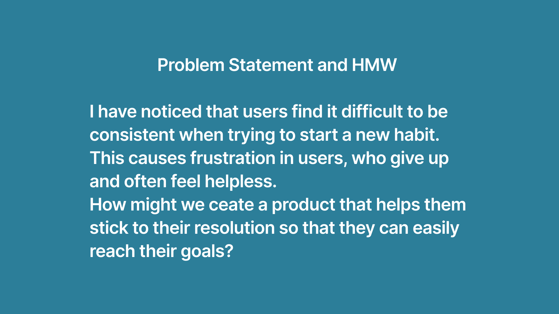
After that I was ready to write my Problem and Hypothesis Statements for this project!

Anne's journey in finding and using change would start with her need to start jogging every morning. Her lack of consistency would make her feel first hopeless , then hopeful, once she finds out about this 21-day concept and the app Change. Her journey would look like this:

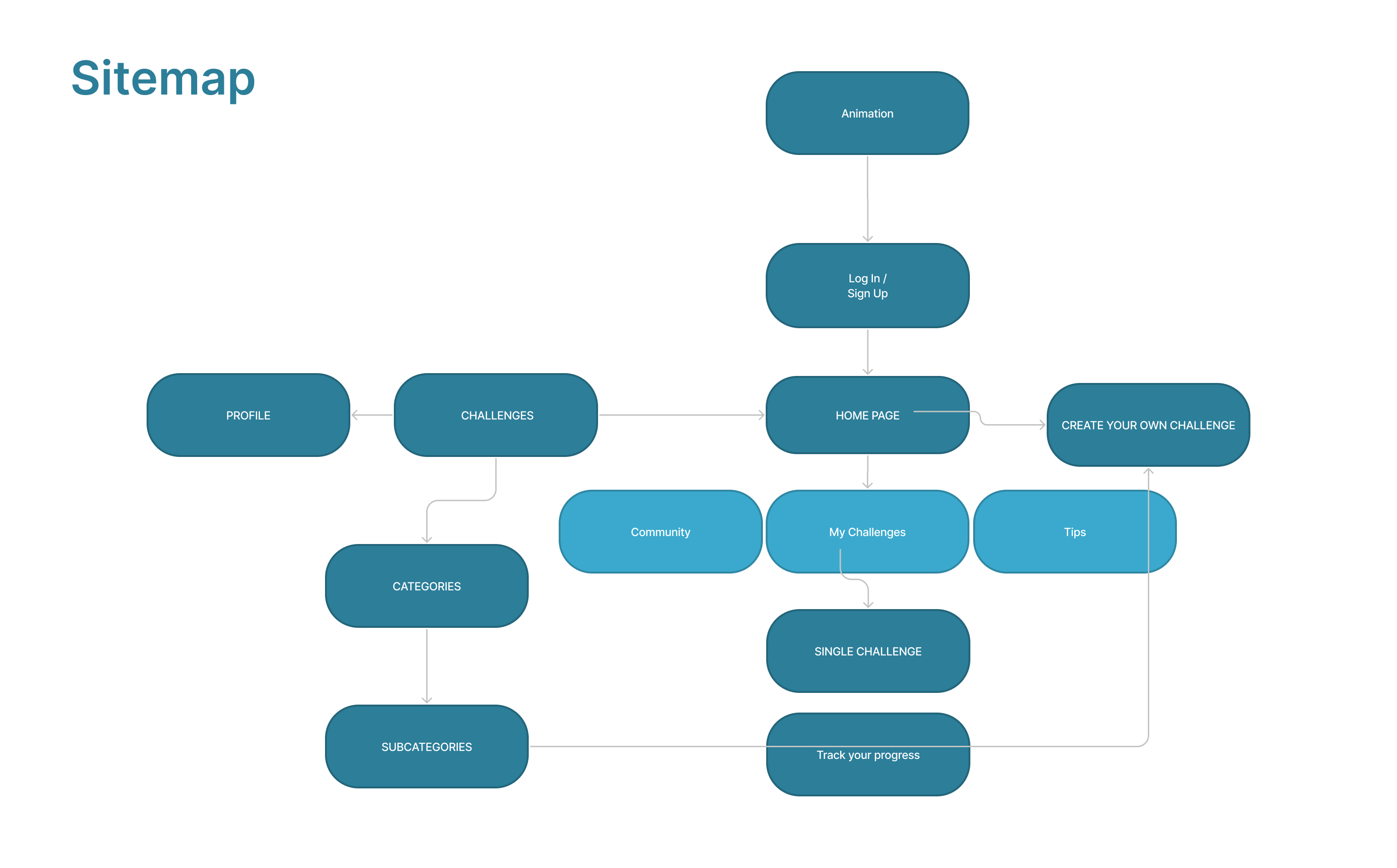
I sketched and defined a sitemap, in order to give a structure to my ideas, for this reason I decided to have categories and subcategories in addition to the usual profile.
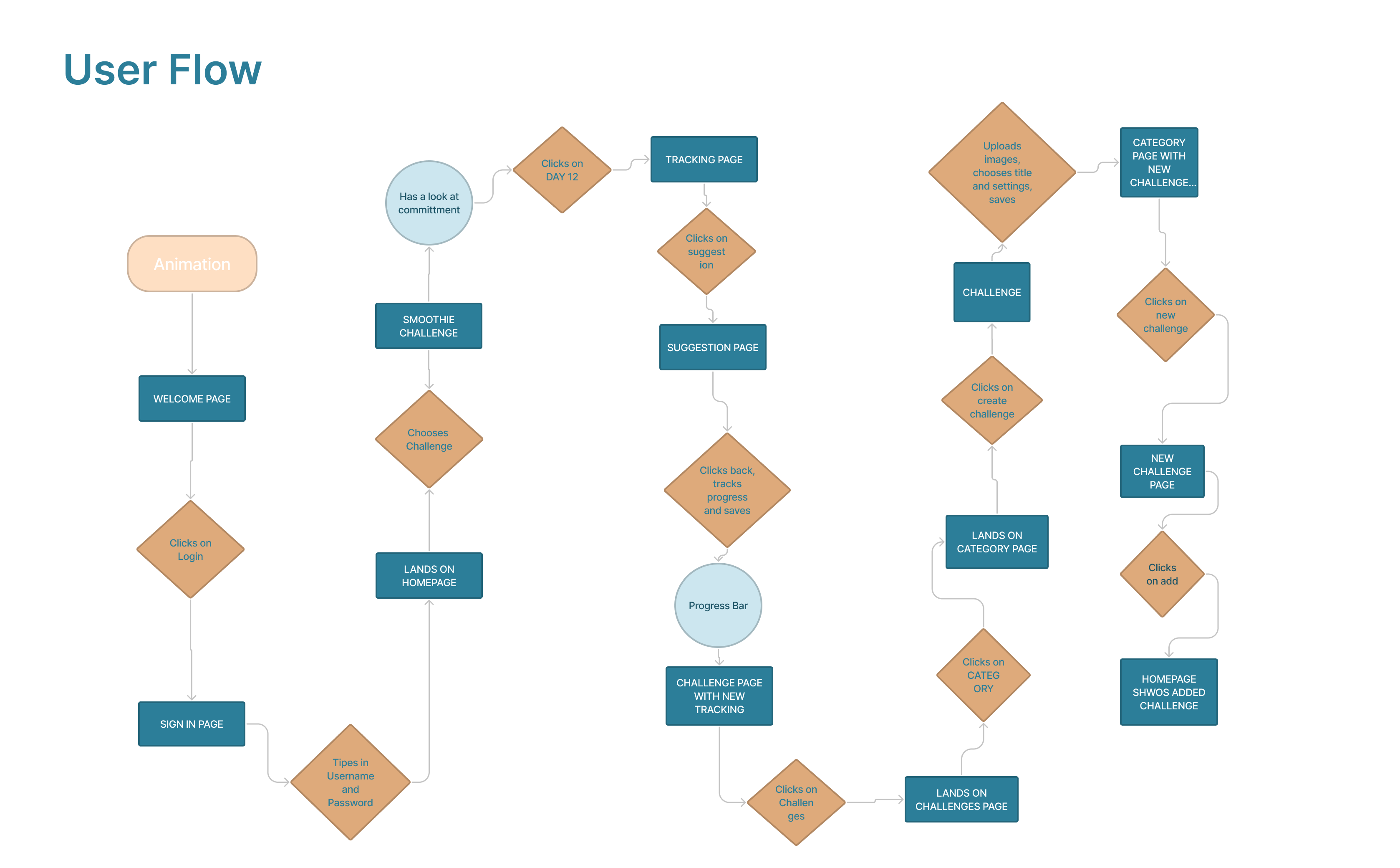
I then imagined Anne‘s Flow through the app. After signing in, she would re-read her commitment, then proceed to track her progress for the day, making sure to have a look at the daily suggestions for inspiration. After that, she decides to start a new challenge and has a look at the challenge page, checking the category of her interest. Not having found what she is searching for, she decides to create her own challenge, making it public, so that other app users could benefit from it. She is now able to see the new challenge in her homepage.
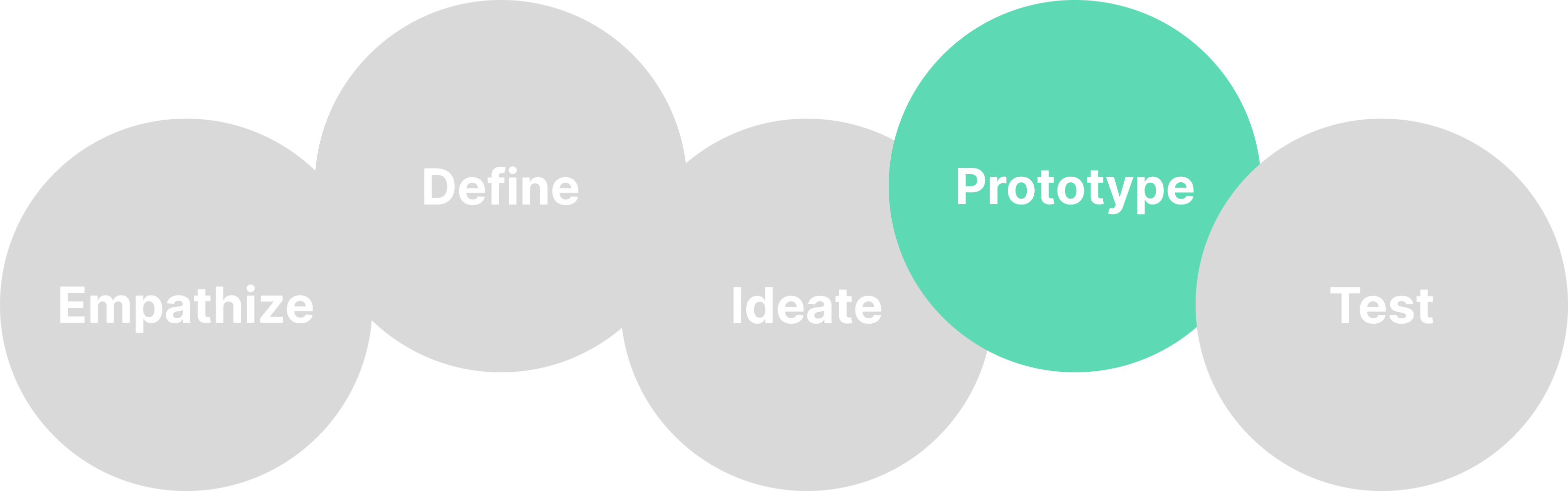
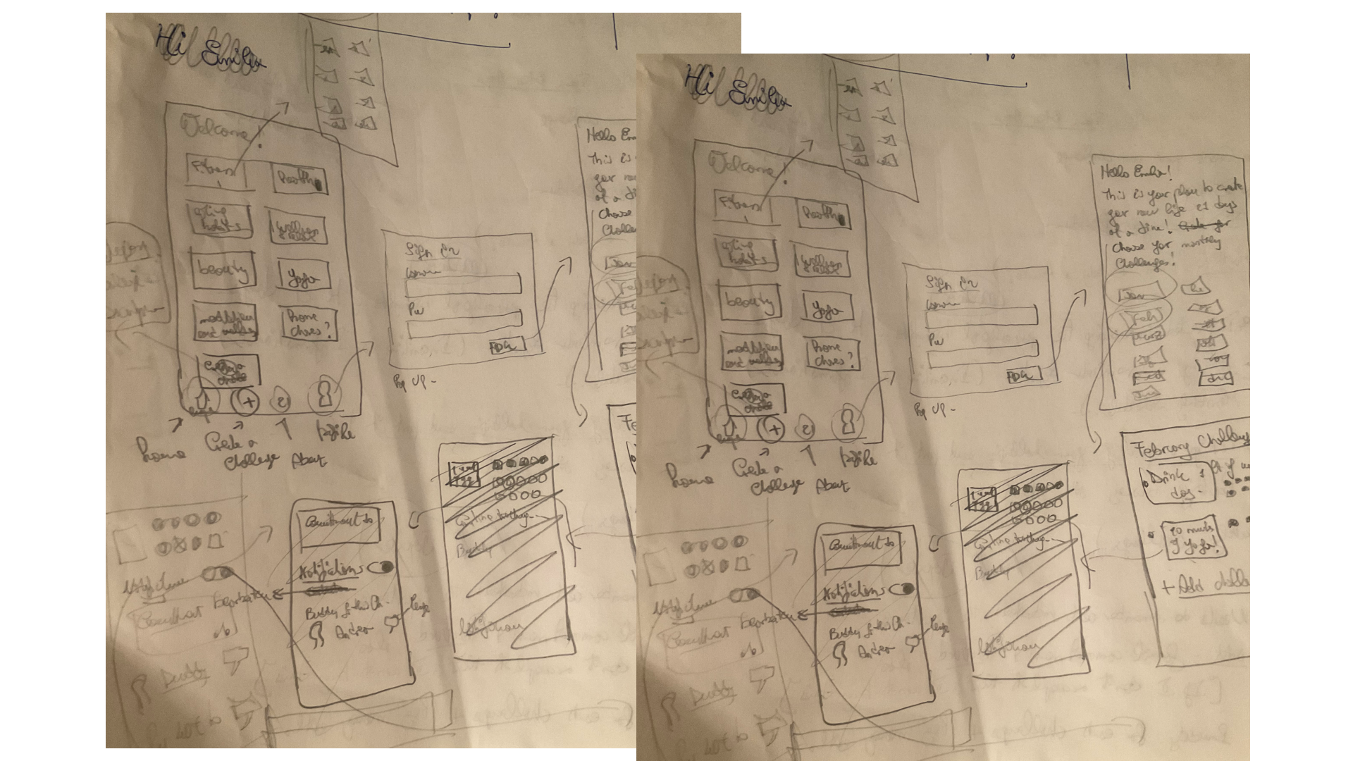
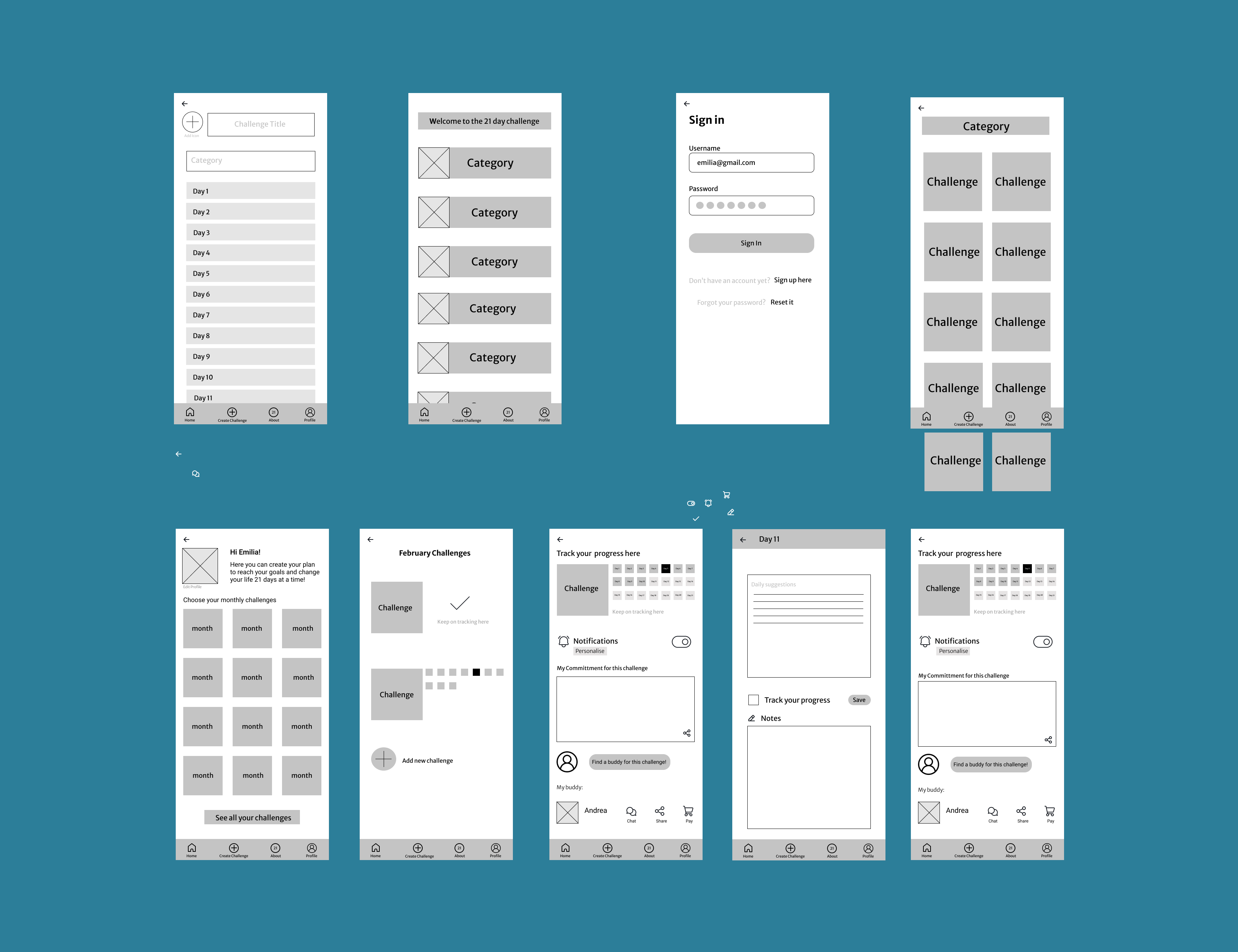
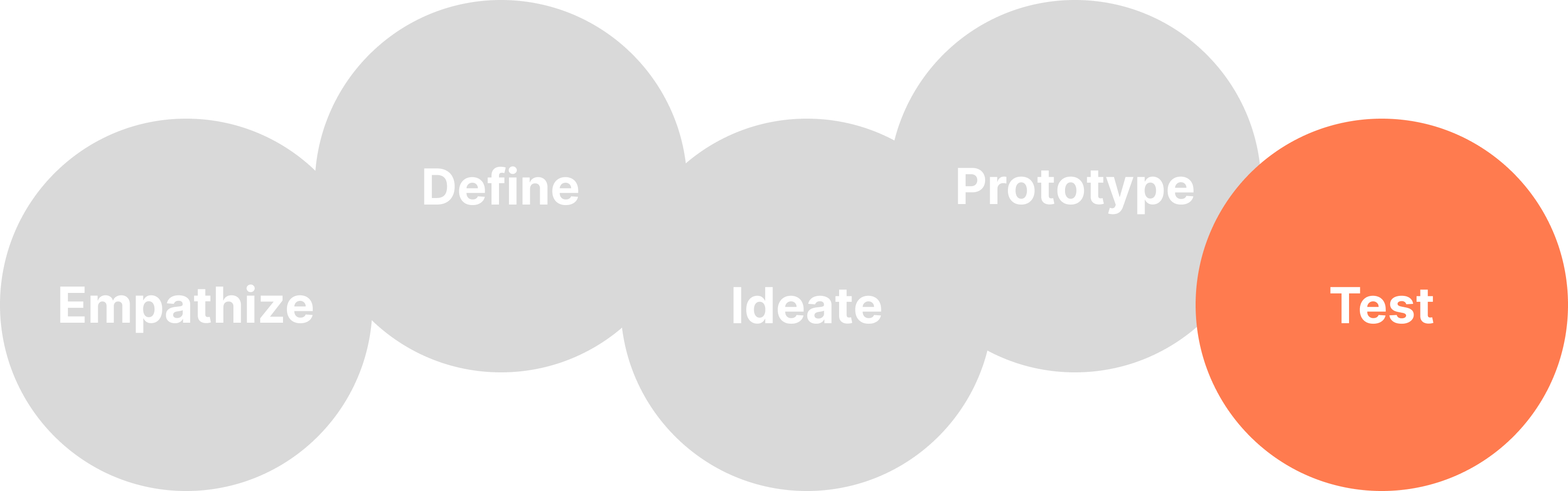
I sketched on paper my different ideas until I came up with something I was satisfied with. Once I decided how my product should be structured, I designed the Mid-Fi wirefremes.
In order to test my prototype I had to have a Hi-Fi version because colour was a fundamental part of my concept. In the first version (which I am not showing here), in fact, a different colour was assigned to each category, and all challenges belonging to one category were designated with that specific hue.
For this reason, I completed the look of the app with colours and icons and I went on to test my creation. I asked different friends and colleagues to use it and give me feedback. It turned out that the majority of them thought this concept was not clear and found my first design interesting but confusing. That made me aware of something that I had not seen before and I understood that I needed to change my whole palette and the colour concept of my app. I subsequently went on to redesign it in order to make it more clear and functional.
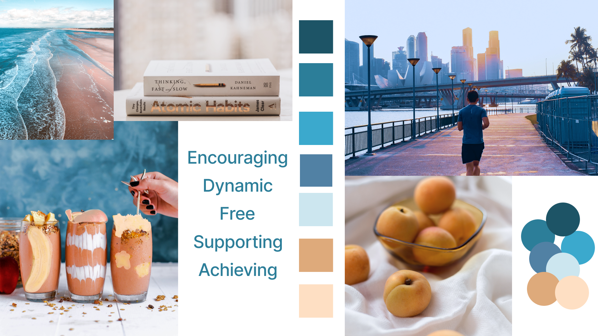
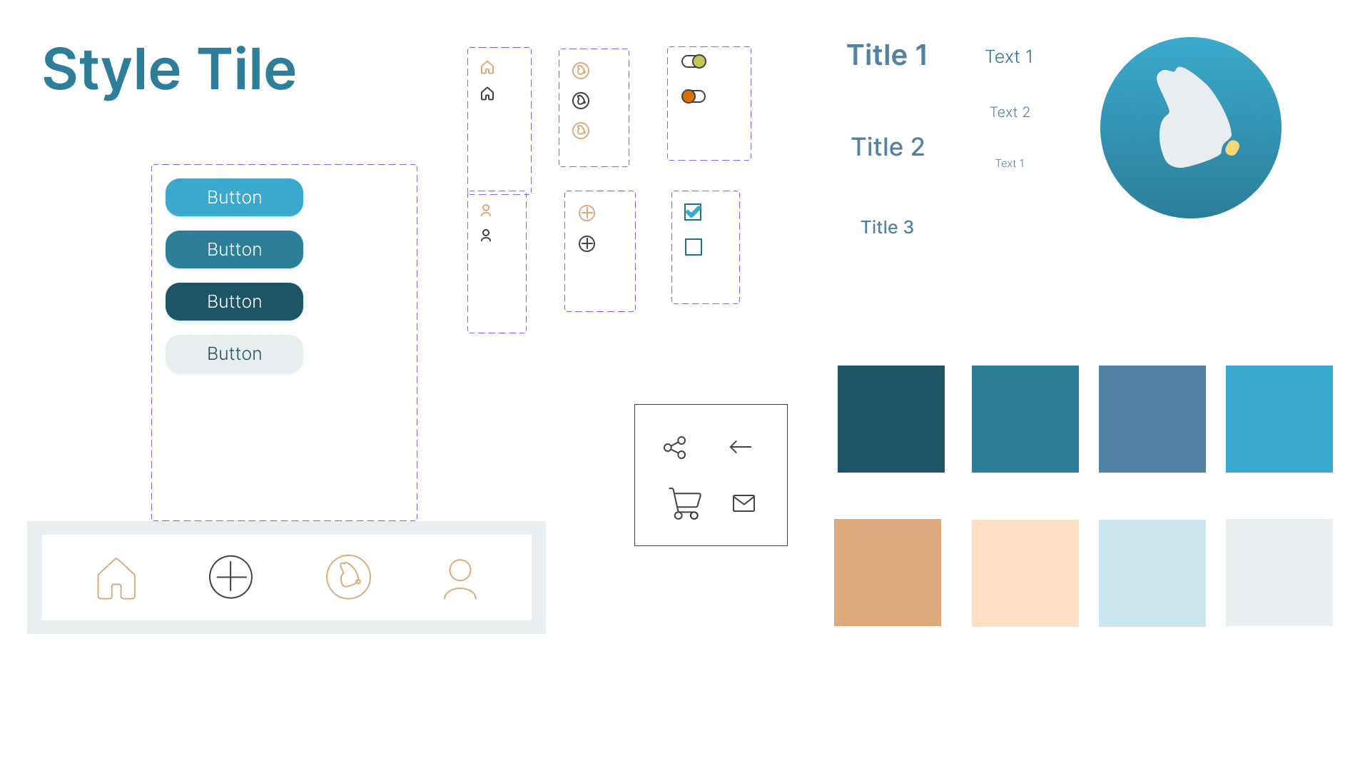
Since I had to rethink the visual part of the app, I collected pictures for a moodboard in order to get a feel of how it could look. I chose pictures that, to me, indicated positive change in many ways, like people jogging or healthy food. I then created my style tile that would contain the colour palette - I opted for a combination of blues with accents in a medium light shade of orange and a peach – and all the elements I would use such as buttons, different components and text styles.
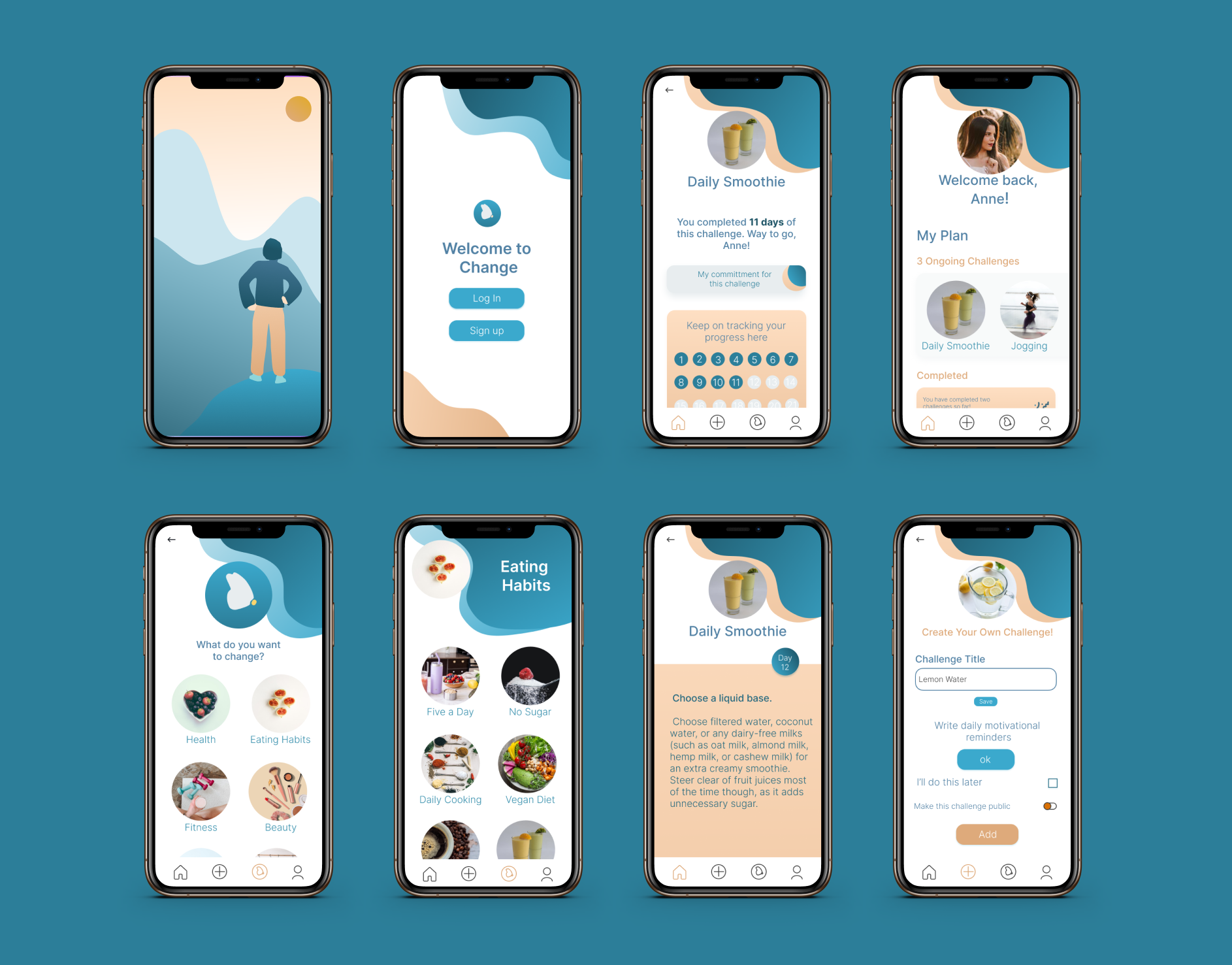
She first signs in into her account with username and password.
The main menu shows the challenges she has started, a section where she can keep on tracking the old challenges, tips on how to reach her goals and the possibility to join a community and find a buddy.
She then chooses the habit she wants to track and lands on the landing page, where she can also find her formal committment, choose to receive daily reminders, or find her buddy for this particular challenge. She can chat with the buddy, share infos with them (such as her commitment), or pay him money in case they have a bet on it.
Before tracking she can also read the daily suggestions with tips that can help her with the new habit.
From there she goes to a list of categories, where she chooses the one she is interested in. Not finding the new habit she wants to start tracking, she creates one.
In the page she is creating she can choose to write daily suggestions and make it public, so that other users can see it on their profile.
Once she created the new challenge , she can see it in the category chosen and add it to her profile.
You can see the prototype in the video below or
you can test the Hi-Fi prototype here.