
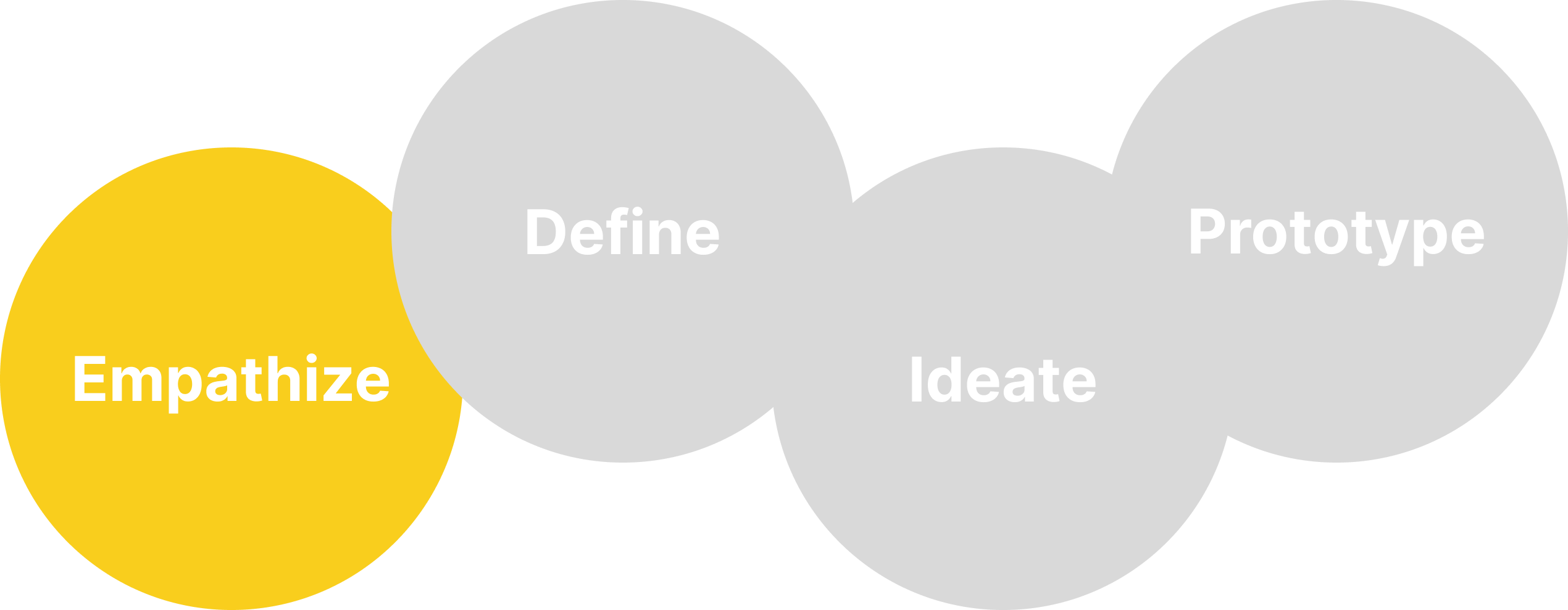
When I started working on this project I tried to figure out how to use prompts in order to create an easy and intuitive user flow that would give the best results for the user’s needs. Even if artificial intelligence has been around for a while, it is only in recent months that we see it boom everywhere, so there still is not much data available when it comes to user behaviour in this specific case. In order to understand more about the interaction between the user and AI in this specific situation I used ChatGPT, asking for suggestions related to hotel bookings and changing the prompts or adding more details as the “conversation” went on.
Here are some examples:

When asked about a hotel room in Rome, ChatGPT asks for more information. The search is too generic and AI needs more information such as check-in times, budget etc. in order to make more precise suggestions. Once I added one extra information (number of people travelling) AI assumed that this is all I know about my trip and that I don’t have any other information, and it starts suggesting hotels

By adding more information to my search, results get more specific.

Here’s another example:

From these simple tests it was clear that giving too general prompts wouldn’t give results as AI assumes that the user knows more about the trip and, subsequently, it asks for more detailed information in order to achieve better results. This gave the idea to use some kind of filters where users would immediately and easily give all the information they know about the trip. This would facilitate search.
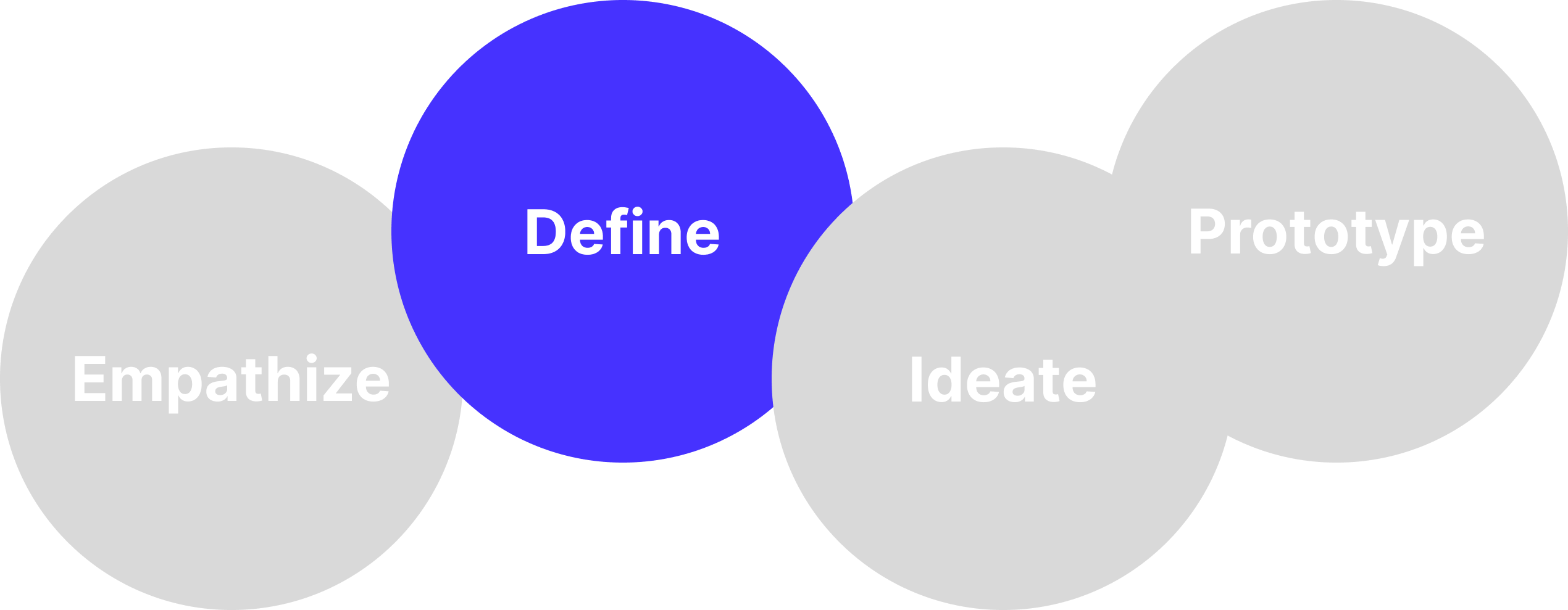
Based on data from previous research made by the company, I created two different user personas I could refer to when designing my prototype.
Jenny is a millennial who loves to travel with her partner.
She has a rough idea of where she wants to go but searches for more information on the internet.
When she travels she uses different apps in order to compare accommodations.
She needs inspiration before booking.
She is looking for a way to easily be inspired, compare and book without having to use different apps

Based on data from previous research made by the company, I created two different user personas I could refer to when designing my prototype.
Mark is a GenZer and is a content creator
He travels a lot and gets inspiration from TikTok or Instagram to choose his next destination.
He likes to travel, explore different places, and also work from different places in the world.
Mark travels alone or with friends and wants to have different travel experiences.
He has a rough idea of where he wants to go but is flexible and loves to be inspired by visuals.
He travels on a budget and prefers boutique hotels.He is looking for a way to get a very personalised experience when travelling.

I then wrote my Problem and Hypothesis Statements.

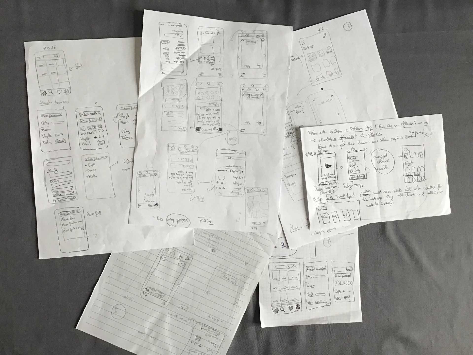
I had many ideas and I decided to sketch them on paper first.
Before designing the interface I had to take many decisions as I faced many doubts:
How many searches are there before I start suggesting hotels?
Do they start immediately or is there a second step in the flow where more information is asked?
Which and how much information should I show when suggesting hotels?
Is using filters a good idea or would I leave the chat “open”? Would it be better to add an “auto fill” or would I just suggest possibilities through buttons?
Before designing I also needed to make some assumptions:
I assumed that the user already knows where to go - usually you book a hotel room after you decide on your destination.
I assumed that the user knows how many people are traveling. I assumed that the user knows the dates of travel.
With all these things in mind I started exploring all these possibilities, talked about them with the rest of the team and finally decided to execute on the one that seems the best option.
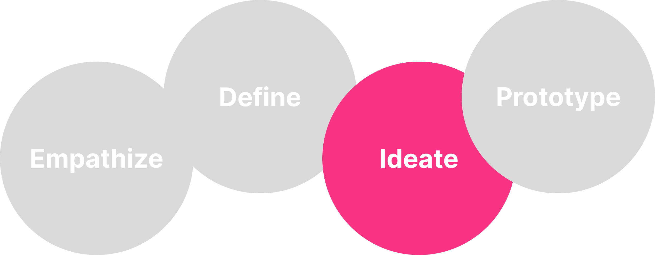
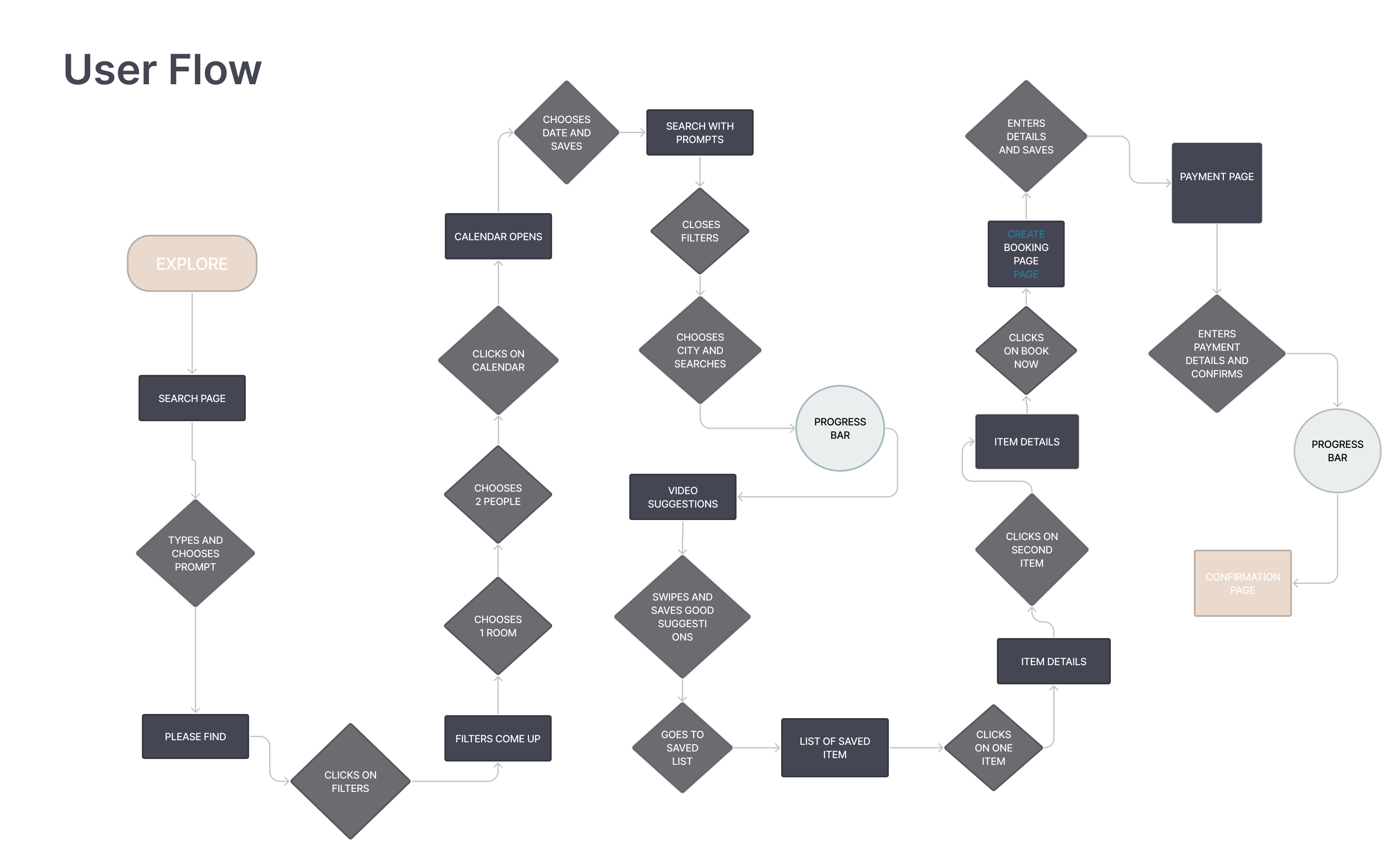
Before working on the Mid-Fi prototype I needed to design a sitemap that would define the UI architecture and then the user flow that I had in mind. I first designed a simple search, then added the booking part to make it more complete.
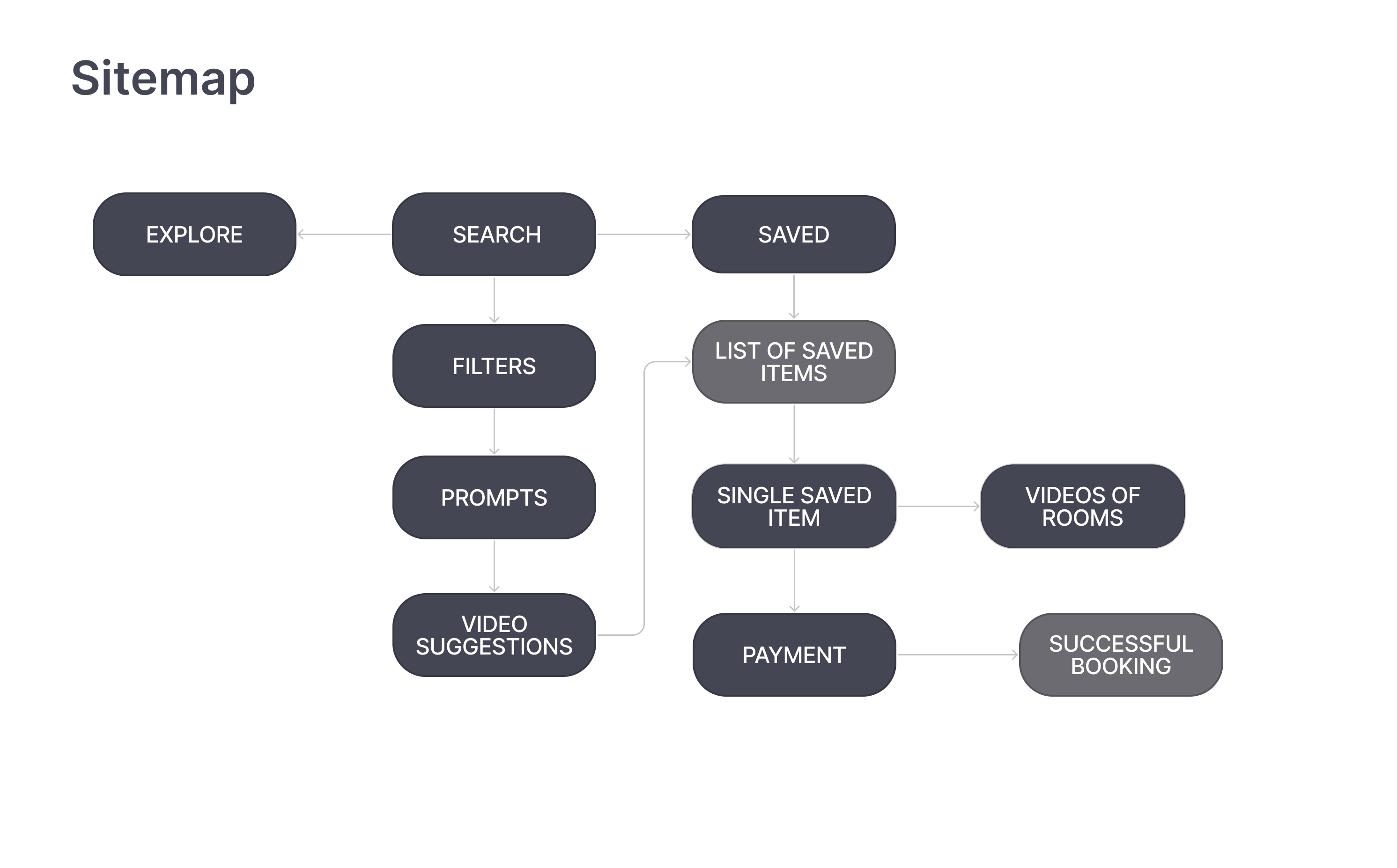

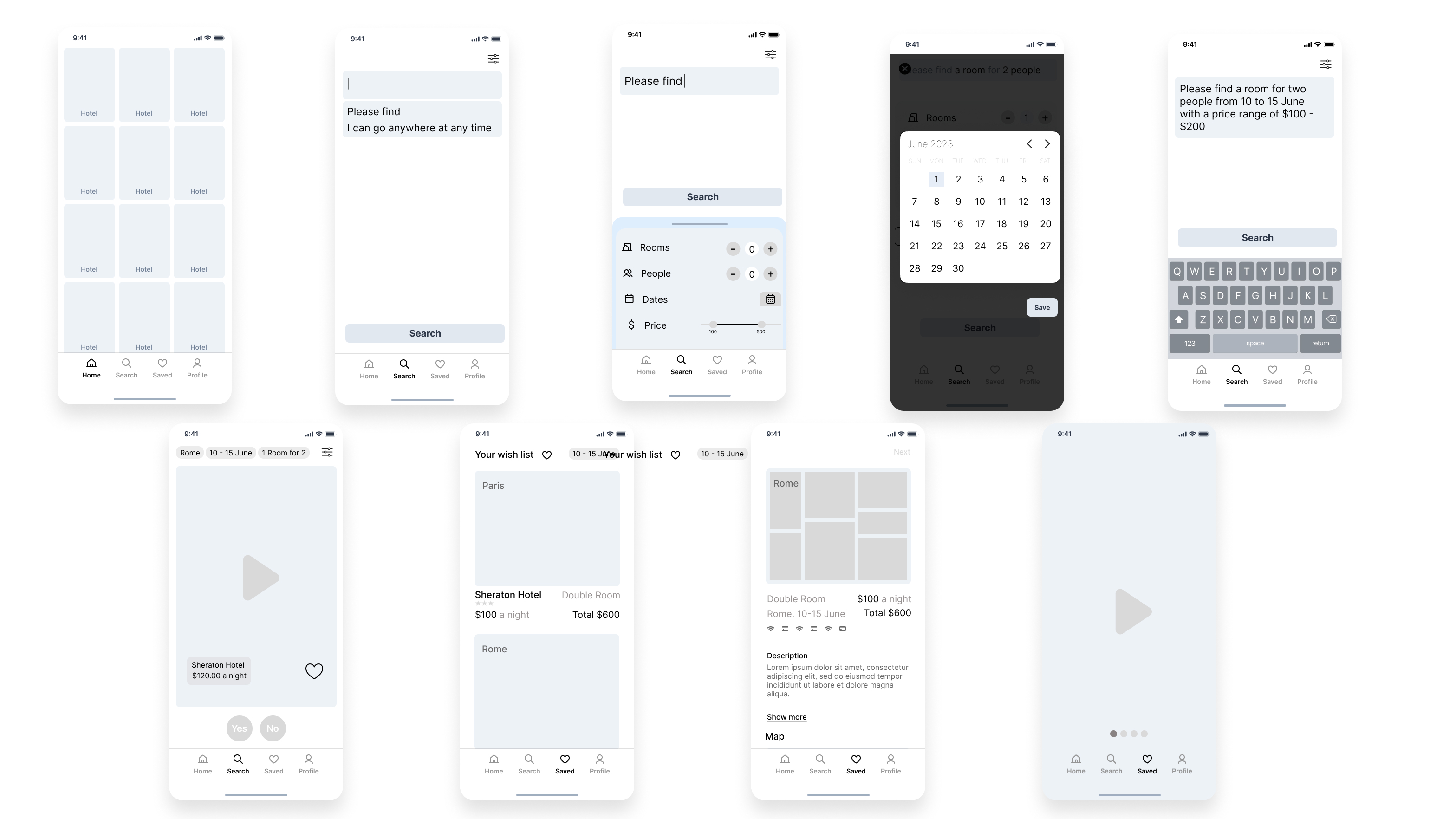
It was now time to design the Mid-Fi prototype. I decided to include filters at the very beginning of the flow, and excluded the other possibilities. I chose filters for the most obvious things such as number of people traveling, number of rooms and dates because, usually, these are the things that users already know when booking a hotel. It was difficult to use a filter for destinations so I decided that the user would just type it in.
Here are the first and the last version of the wireframes. Between these two there are many variations I created after testing and feedback from the senior designer and the product owner.
While working on the Hi-Fi Prototype I made some small changes in the layout and design, but the flow remained the same. It is a simple, straightforward flow that goes from search to booking.
When the user goes on “Search” he has the possibility to use some filters; I chose these filters because they refer to things that users commonly already know when booking a hotel. I also left an option for those who do not have any constraints and want to be inspired while booking.
For the suggestion page decided to use the swipe method, similar to that used in dating apps: the user would swipe right when they like a video and left when they don’t. While doing so the algorithm would pick up on the user’s preferences and start suggesting more and more hotels similar to the ones that have been swiped right and that would be more fitting to the user’s taste and needs.
Users can save the hotels they like most and want to have a look at later as, I suppose, they would want to know more details about the single options.
When the user goes to “saved” they can find all the saved options and see all the details. More videos of the same hotels are shown, together with price, availability, type of room, amenities, location, etc.
Once they find a place they’re happy with, users can directly book a room. Below, you can see a video demonstration of the flow.
You can test the prototype here
